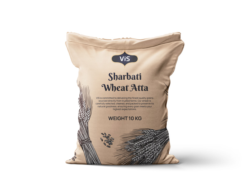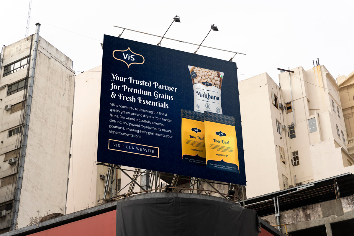
The image illustrates the iterative refinement process for the VIS logo, focusing on achieving a balance between boldness, simplicity, and brand relevance.
Each stage explores typography, proportions, and subtle symbolism, culminating in a design that reflects trust, growth, and the core essence of VIS’s products.


A color palette of Oxford Blue and Sunset was chosen to
signify purity, health, and prosperity.
The final logo is simple yet impactful, scalable across mediums, and aligned with VIS’s mission to be a trusted partner in the food supply industry, strengthening its identity as a forward-thinking and reliable brand.
1234567890
ABCDEFGHIJKLIMNOPQRSTUVWXYZ
abcdefghijklimnopqrstuvwxyz
Procave is a full-service digital branding agency that helps startups and small & medium corporations to make their digital identities via websites & digital marketing.
Procave Digital Agency
Your Brand, Our Focus!
Procave Digital Agency
Hey, how can I help you today?